Refreshing MarketingNProduction'sMarketingNProduction's brand and website
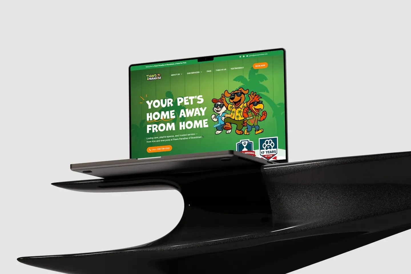
I refreshed the logo, restructured the site around four service paths, then designed and built it, so a two-service agency finally looked like one company.
Sitting with the founder
MarketingNProduction does marketing and the content production behind it. On a call with the founder, four problems kept coming up.
- 1Visitors left after one page
- 2The site wasn't converting
- 3Navigation was confusing
- 4The brand didn't match the work
Keeping the magnet
The original logo had a good idea, a magnet for an agency that attracts customers. I kept it and fixed the execution.
Four pages, one services menu
I cut the site down to four pages, with every service under one menu. Each service page ends with a way to book a call.
- About us
- Services
- Web design
- Digital marketing
- Content production
- Branding and PR
- Portfolio
- Contact
Thinking through the flow
The homepage answers a new client's questions in the order they come up.
- 1What do you do?
- 2Can I trust you?
- 3How do I reach you?
A small style system
One clean sans, an italic serif for personality, and the colours of the new logo.
Typeface
Expert Marketing and
Creative Solutions
Colour
- Green#0E5116
- Cream#DBC6A6
- Black#000000
- White#FFFFFF
Outcome
Three weeks from first call to handover. The client's team now runs the site and its SEO.
My main takeaway: keep what already works. Rebuilding around the magnet, instead of replacing it, made the refresh an easy yes.